video
- Get link
- X
- Other Apps

- Get link
- X
- Other Apps
Google analytics dashboards allow you to visualize a variety of different data from your website or web app into charts and tables. Creating a dashboard of your Google Analytics data gives you insights into what’s happening on your website from number of visitors to bounce rate to average time on page. These insights allow you to iterate on your site and create more demand for your product offering.
In this tutorial, we’ll explain how to create a simple dashboard with Google Analytics data within the platform itself.
Google Analytics stores a lot of insightful data based on your company’s website activity. With that, harnessing the power of Google Analytics doesn’t have to be difficult. While Google Analytics offers useful and pre-made standard reports, you can easily create a customized dashboard with your Google Analytics data that tracks the metrics that matter most to you in one single view.
To create your Google Analytics dashboard, follow these steps:
Google Analytics names their charts as widgets. While the example above shows a dashboard with just a Pie widget, or chart, and a Table chart, Google Analytics offers several other types of charts that users can enable on their dashboard.
Timeline
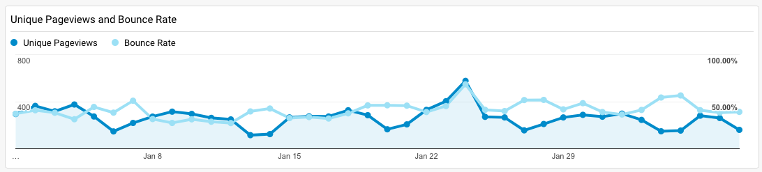
A timeline shows data of a specifically chosen metric over time. This metric is often shown as connected dots that show growth or progression over days, weeks or months. In the example below, the timeline visualizes Unique Pageviews with Bounce Rate over a six week period.
Metric
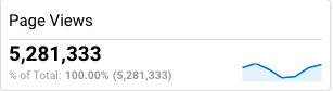
A metric shows your data as a single value number. The metric visualization is great to show single values like Daily Active Users, Monthly Active Users, etc as a number.
Geomap
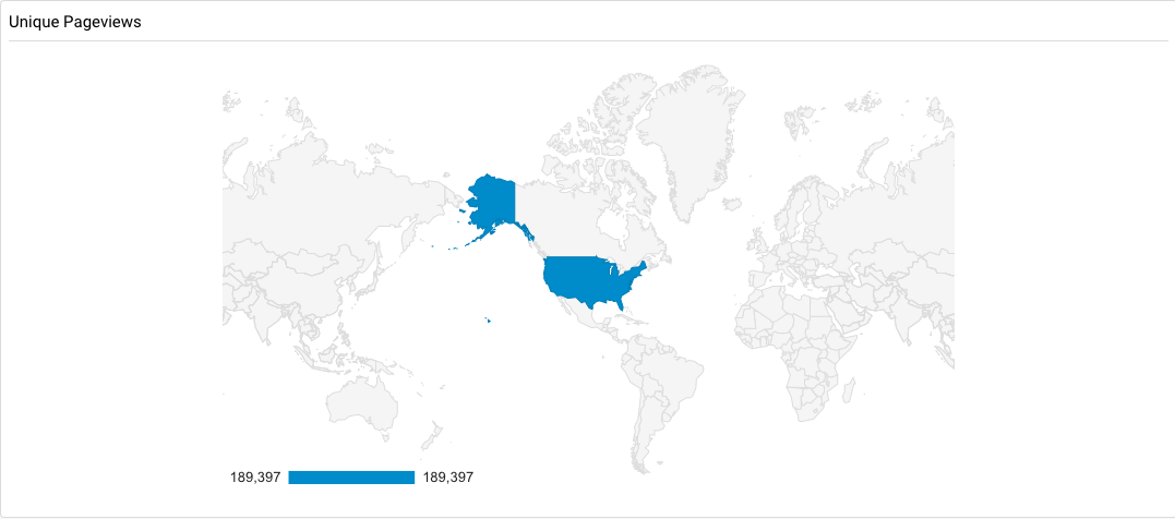
A geomap visualizes your Google Analytics data across a map or selected region. This is used to visualize users based on location, etc.
Bar
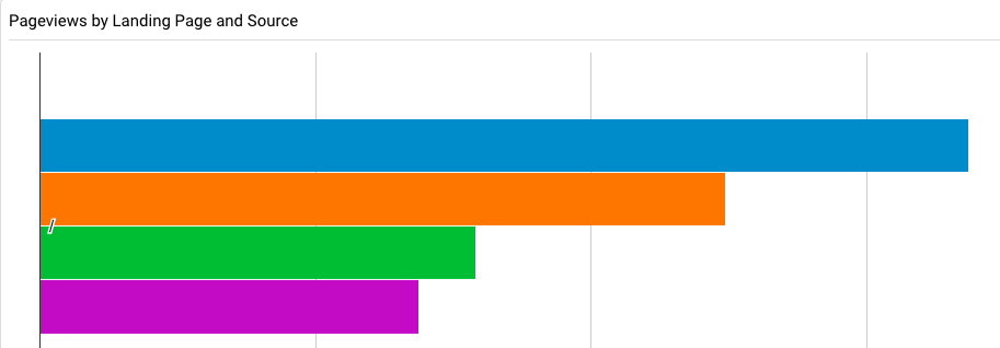
Bar widgets are used to visualize discontinuous (or discrete) data or to show the relationship between a part to a whole. This could be used to compare conversions from different traffic sources.
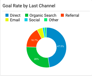
Pie
Pie charts show the contributions of data as a percentage of a whole. For the example below, the donut chart (a variation of the pie chart) visualizes the goal rate by last channel attribution.
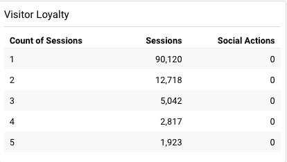
Tables
A table chart visualizes data in terms of rows and columns. For the example below, the table chart shows the Visitor Loyalty metric in terms of Count of Sessions, Sessions and Actions.
While users are able to create charts and visualizations of their Google Analytics data, users are limited to using the standard widget offerings from Google Analytics. You can also use a data analytics tool, like [Chartio](/, that enables users to analyze their data with different chart types and connect disparate data together.
Creating custom dashboards with your Google Analytics data is an important way to uncover insights from your website activity. Creating a Google Analytics dashboard doesn’t have to be difficult as Google Analytics provides six types of charts that are all customizable according to the questions you’d like to answer
we have 20 dashboards with 12 widgets in each view/property in your GA account


Comments
Post a Comment